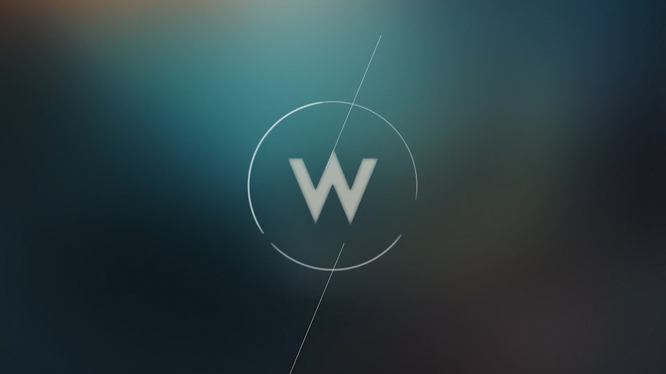
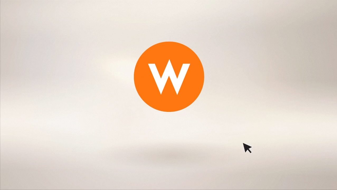
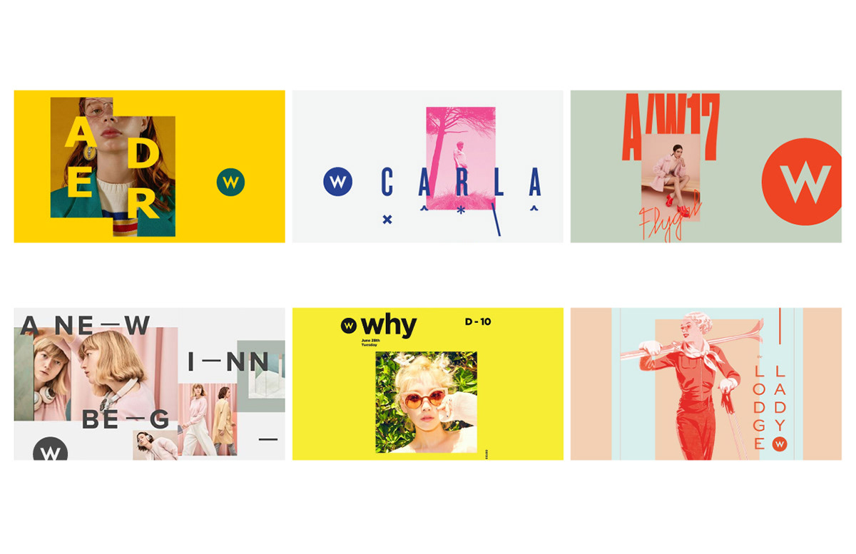
My team was asked to develop a new concept to refresh the look of W Network for a fall promo and potentially to be an ongoing brand expansion depending on the reaction from the viewers and stakeholders.


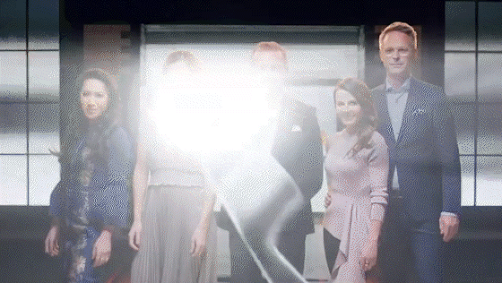
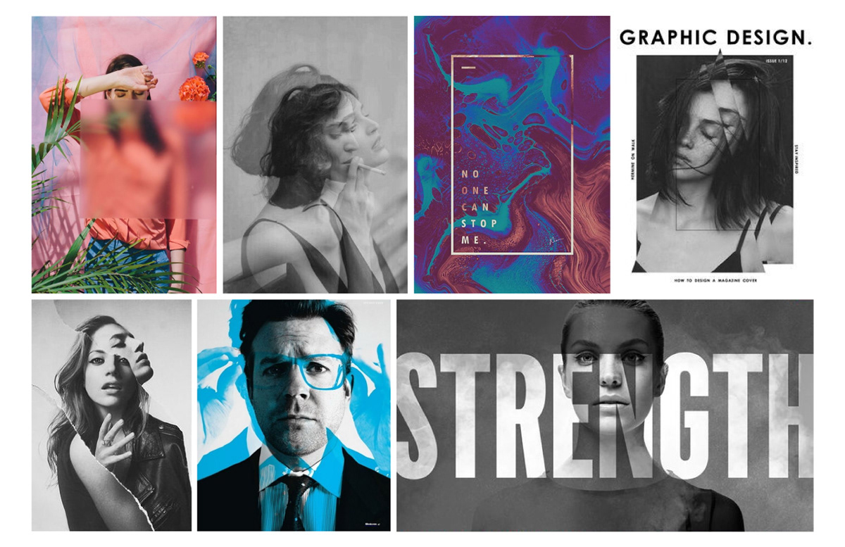
After some exploration of W logo being placed in different looks and feels, I started to narrow it down to a dramatic lens effect with a distortion look to convey the message of giving a twist to the existing branding.

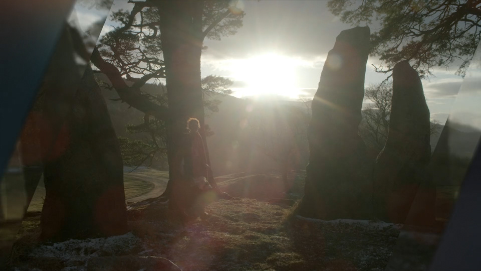
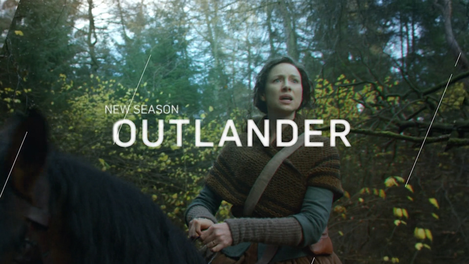
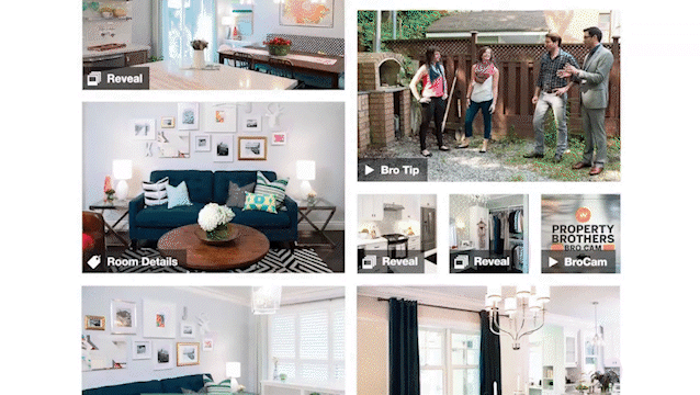
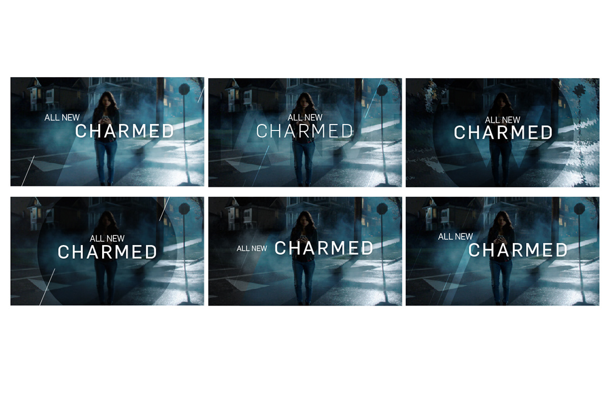
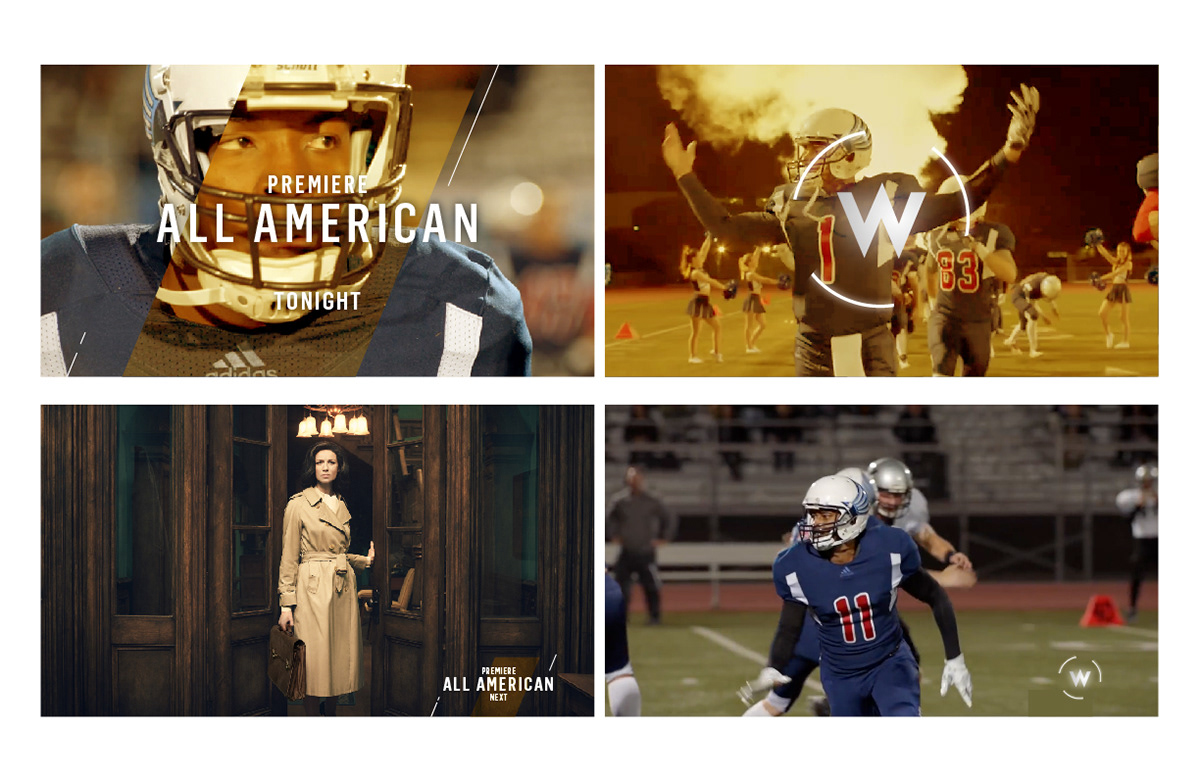
After locking on the concept, I started creating mockups to see how it'd actually work on broadcast with the existing show titles and types.
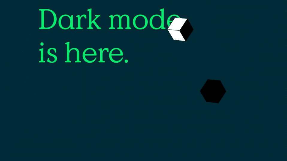
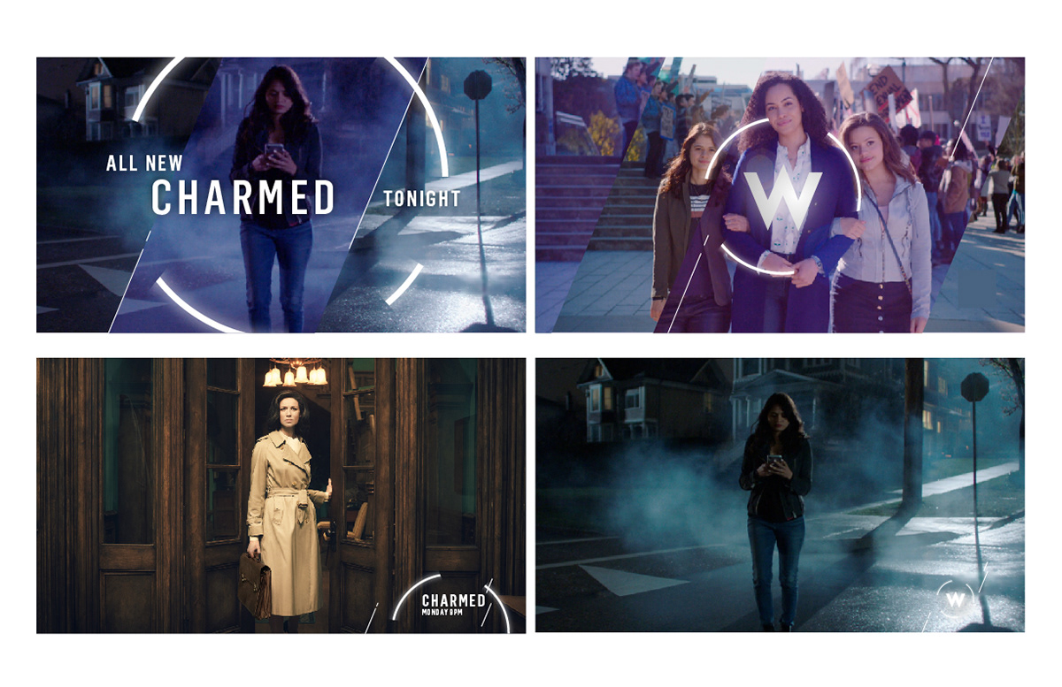
Based on some feedback from the leadership, I also started expanding this concept into different color themes to promote different primetime shows.

This fall promo successfully launched with this new look and the channel ended up being rebranded completely based on this expansion.